
Lead conversion is something every business owner and marketer struggles with, but lead conversion is the endpoint of a long process of building trust through content.
All the content on your website has a single purpose — establishing trust with potential customers.
But the trust dies the minute they see an issue on your contact page.
The whole point of having a contact page is to make sure prospects have both correct contact information and easy access to customer support reps.
In fact, 51% of users believe that thorough contact information is the most important element on any website. Thus, a poor contact page can kill your conversions in a jiffy.
(Learn more powerful lead conversion strategies with the Blue Steele Solutions ebook 13 Steps to a Clear Marketing Strategy — click the button to check it out now).
Lead Conversion Depends on a Good Contact Page
Let’s get one thing straight: If you’re expecting to get any conversions, from simple contacts all the way to high-value sales, you have to first build trust with your potential customers — no one is going to buy from a website they don’t trust.
A faulty contact page with unnecessary, incorrect, or misleading info is not going to go over well with prospects. In fact, 44% of website visitors will bounce off your website (and likely never return) if they don’t get relevant contact information.
If you just felt a surge of anxiety and realized that your contact page is not up to the mark, you don’t have to go through the painful process of an entire makeover for the page. With some smart and cost effective tweaks, you can use the contact page to drive business growth.
So let’s dive into this topic: lead conversion optimization. Here are five contact page tweaks to help your convert more.
1. Get Your Grammar (and Punctuation) Right
Let’s eat dad!
Let’s eat, dad!
Such silly punctuation mistakes can make your brand a laughing stock of the internet world, or at the very least, make you lose trust in the eyes of your customers.
Users might engage with you for cheap laughs, but they are never going to buy from you. The minute you get your commas or P’s and Q’s wrong, 59% of prospects are already running out the door.
To establish contact page credibility, come up with a solid proofreading system that leaves no opening for grammar nazis to attack. If your contact page copy uses jargon and slang to grab attention that’s acceptable, only if you know the rules well and know when (and how) to break them.
Here are few tips on how you can come up with a proofreading system that allows prospects to build trust:
- Beware homonyms — carefully check words that share the same spelling or pronunciation but have different meanings. Be extra cautious of words like complement and compliment as they can create confusion and lead prospects to abandon your page.
- Read it sdrawkcab — Reading what you’ve written backwards can help you see missing words or slight misspellings that you miss when reading normally as your brain fills in the information that it knows is supposed to be there — reading backwards forces you to evaluate what you’ve written as it really is.

- Check and recheck contact details — It’s the single most important piece of information on your contact page, so you can’t afford to get your contact details wrong. Adding 6 instead of a 9 in your phone number will put a major dent in your lead conversion for the month.
- Get some fresh eyes — To make sure you didn’t miss anything, ask a colleague or a friend to have a look at the copy. A second set of eyes often sees mistakes right away as your friend has no preconceived notions about what you’ve written.

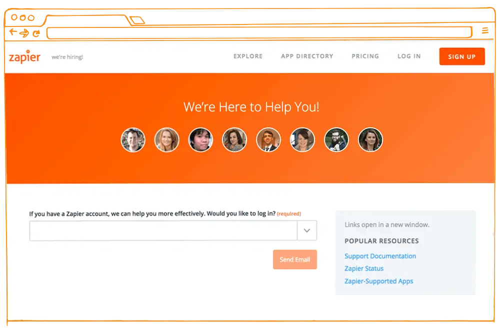
2. Add Images of People, Not Buildings
Your prospects want to be assured that there is actual human involvement in the sales process. When your contact page has a high degree of ‘Human appeal’, users find a certain sense of comfort and lead conversion increases.
Take out that stock image of the shiny buildings or glittery skylines — it serves no purpose. Instead, add images of people, your team members, and provide short bios. This information helps prospects to find the right person to resolve their query.
By highlighting human presence, prospects will perceive you to be people-centric. When leads see you as a customer support engine that cares, there is a gradual shift in their behavior as well.
The Psychology of Reciprocity encourages prospects to show you the same level of care and generosity, and lead conversion increases.
Zapier, a tool used to integrate web applications, has made a conscious effort to humanize their contact page. A series of questions are asked which help reps in understanding the context of each user’s issue. At the same time, users are able to find the right person to resolve their unique issues.
3. Create a Roadmap to Improve Lead Conversion
To increase lead conversion on your contact page, provide links to useful information and label each link clearly. Whether it’s self-service tools or active support, make sure your customers can easily find the precise service they need. The design of the page should support this goal, organizing information as clearly and simply as possible.
The idea is to create a roadmap that helps users easily and quickly find all the support solutions at their disposal and to select the option that’s right for their needs.
First, make navigation easy: Consolidate all support options on one page. When all the information is in one place in a concise, clear, obvious organization, the utility of your contact page shoots up (along with your lead conversion!).
Second, keep your active support vigilant and highly responsive. When prospects send emails, your support team needs to be quick in responding to them.
To be on top of things, every support rep should be extensively trained and shown what to do. Use a shared inbox to assign tasks to each rep and respond to queries effortlessly.
Thus, the efficacy of your contact page depends on your website’s usability and your customer support team’s response time. If either of them fails, chances are prospects will not proceed ahead.
Freshbooks, a cloud-based business accounting application, is a great example of how a business can increase the utility of their contact page by keeping everything in one place.
Whether it’s active support or self-serve resources, everything is available on the same page.

4. Use the Same Brand Elements You Used for Your Homepage
Inconsistency in your branding between your homepage and contact page will slow down prospects and reduce lead conversion rates.
These discrepancies make prospects feel the same way you feel when you walk into a store that looks vastly different inside than it does outside — you feel almost like you’ve been tricked, and you may even turn around and leave. That trust is broken when a lead on your website reaches a page that doesn’t look the way they expected it to.
A homepage is a welcome wagon for users. Establishing branding consistency on every page of your website from the get-go allows prospects to easily move through your website, increasing the probability of lead conversion.
To get you started, here are a few brand elements you need to make sure remain consistent:
- Color — One of the first elements prospects notice is color. Make sure that you apply the same brand colors to your contact page as you have on your home page. If you can’t use your primary color, at least use a secondary color.
- Placement of logo — The placement of the logo should remain the same. Even the alignment should not be compromised.
- Core value offer — Reminding prospects about your core offer is never a bad idea. Use your contact page to re-emphasize your offering, removing any doubts that prospects might have.
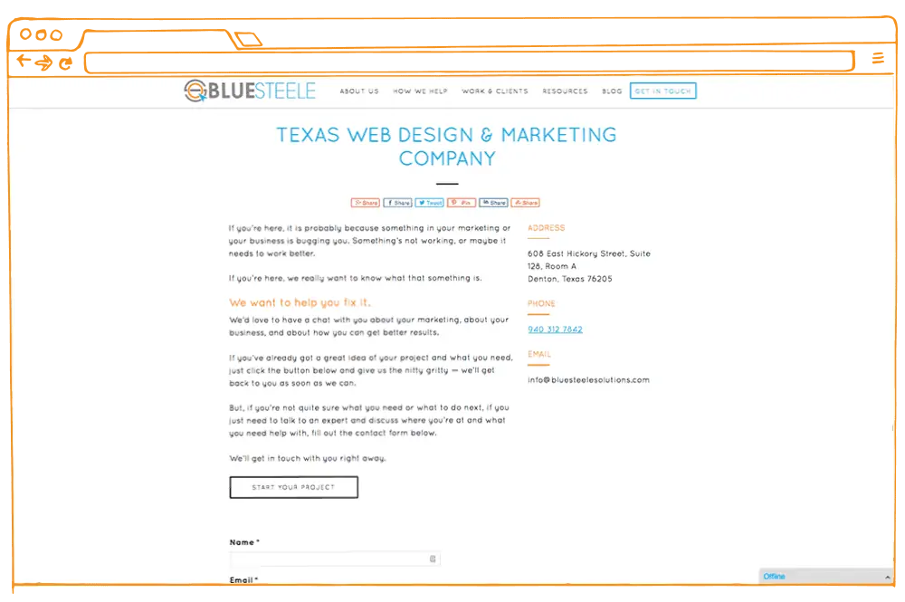
Blue Steele Solutions has kept the consistency between its home page and contact page intact. The background is white and the text colors, blue, black and orange, are used on both pages. The re-emphasis of the core offer confirms to leads that they’re in the right place.
Homepage

Contact Page
5. Make Your Website Responsive
Mobile devices account for nearly 2 of every 3 minutes spent online, and Google has been penalizing non-responsive websites for the last two years (at least).
A responsive website is an absolute necessity in today’s world — you need to make sure every page on your website is mobile responsive.
However, there’s one place where even mobile-responsive websites fail — the contact form. Creating a mobile friendly contact form is critical for lead conversion.
A small screen with a complicated keypad doesn’t make it any easier when filling those long and tedious contact forms, so make sure yours displays well and is as simple as you can possibly make it.
To make it user-friendly, cut the long forms into shorter versions, and include only those fields that are necessary.
Ideally, full name, email address, and one phone number, would suffice. This keeps prospects from losing interest, increasing your chances to convert.
Apart from this, make use of collapsable menus and dropdown lists — they can cut down the time needed to browse through a website.
Check out this example:

Final Thoughts on Lead Conversion
To get conversions that surpass your expenses, be proactive when designing your website — Do an extensive brainstorming session on what kind of website you need and how will your contact page fit into that picture.
When you’re clear about the objective of your website, you can more clearly define the purpose of your contact page.
For websites that have been around for a while, employing some of the techniques above can be a simple way of increasing lead conversion and ensuring that you’re not missing out on any potential sales.
Increase Lead Conversions, Traffic, and Retention
If you’re serious about increasing lead conversions, website traffic, and customer retention, check out Blue Steele Solution’s ebook Analyze Your Marketing — 13 Steps to a Clear Marketing Strategy.
Far beyond your website, this ebook will help you look at your current marketing holistically, identify problems and opportunities, and create a marketing plan for the future.
Click the button to learn more.