If you need a new website, or you want to upgrade your existing site, you may have asked yourself the following question: what are responsive websites?
Responsive websites have been around for a while, but they have become much more popular in the last couple years. You’ve heard the buzz, and you’re interested in the concept; let’s talk about the product itself. So, what ARE responsive websites anyway?
Responsive Websites Are Websites That Change Format Depending On The Size Of The Screen On Your Customer’s Device
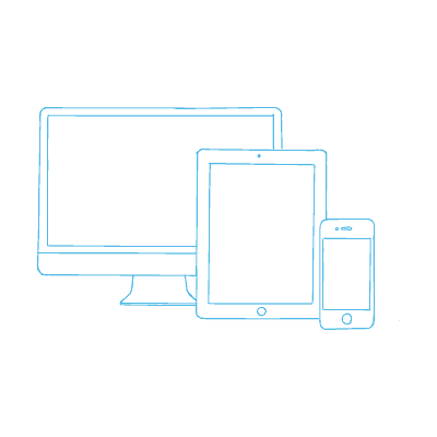
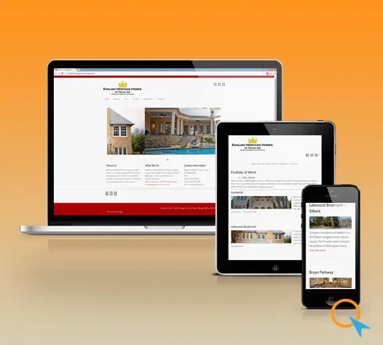
Responsive websites are websites that respond to a variety of view screens, which means that they change their format depending on what kind of screen you are viewing the website on.
Believe me when I say this: you need a responsive website. Not only does it make your content more available to your customers, no matter what device they are viewing your website one, but it also makes life easier for you because you only have to keep your content in one place: you don’t need a separate mobile website.
What Are Responsive Websites Good For? Why Can’t I Just Have A Mobile Site?
Responsive websites are different from, and better than, mobile versions of websites.
Mobile websites are usually completely separate websites for mobile viewers. Mobile websites have a variety of drawbacks, but the main drawback is that you have to keep and manage your content in two separate places, which causes twice as much work as normal.
Not only that, but mobile websites sometimes restrict content that is normally available on the full site. Nothing can frustrate a customer quite like taking their content away, so the mobile-and-traditional-website approach is probably not the best way to go.
Are Responsive Websites Just Shrunken Versions Of My Regular Website?
Definitely not! Mobile screens are small enough as it is, so the last thing we want to do is display tiny text that the user has to zoom to see. What a responsive website does is change the layout of your content of to fit the customer’s screen without changing the size of the content much.
You never have to zoom in on a responsive website from any device; instead, your content rearranges itself to fit the screen of the customer while maintaining a reasonable size.
What About Adaptive Websites? Are Responsive Websites The Same As Adaptive Websites?
Not exactly. Adaptive websites respond to only as many specific screen sizes or devices as the programmer sets them up to respond to. Although this may have worked a few years ago, today it doesn’t really work because there are so many different screen sizes out there.
And it’s not like this is going to change: as more and more smart devices come onto the market, more and stranger screen sizes are going to be available. You want a website that will respond to all these different device screens, not a website that will only adapt to a few pre-defined screen sizes.
What’s The Bottom Line?
The bottom line is that you need a responsive website to compete in today’s online marketplace.
Everyone looks at websites on mobile devices these days, and if you aren’t ready to serve your customers the content they want on the device they prefer to use, you will lose business. A responsive website is critical for a successful online marketing campaign.
What Are My Options For Responsive Websites?
If you’re convinced that you need a responsive website, contact us today to review your project and get a quote.